How to Read Our Forecast Maps
A quick guide to understanding the temperature departure, precipitation departure, and probability maps published on this site.

The maps published on this site come from two forecast systems — a medium-range monthly ensemble and a seasonal multi-model ensemble — and use a consistent visual language across all products. Here's what you're looking at.
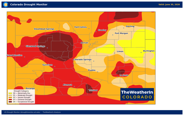
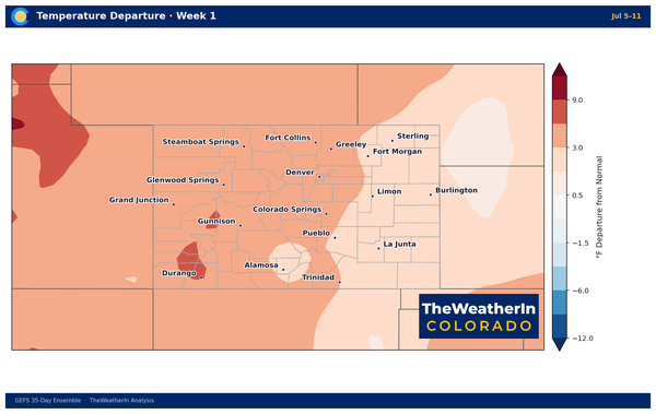
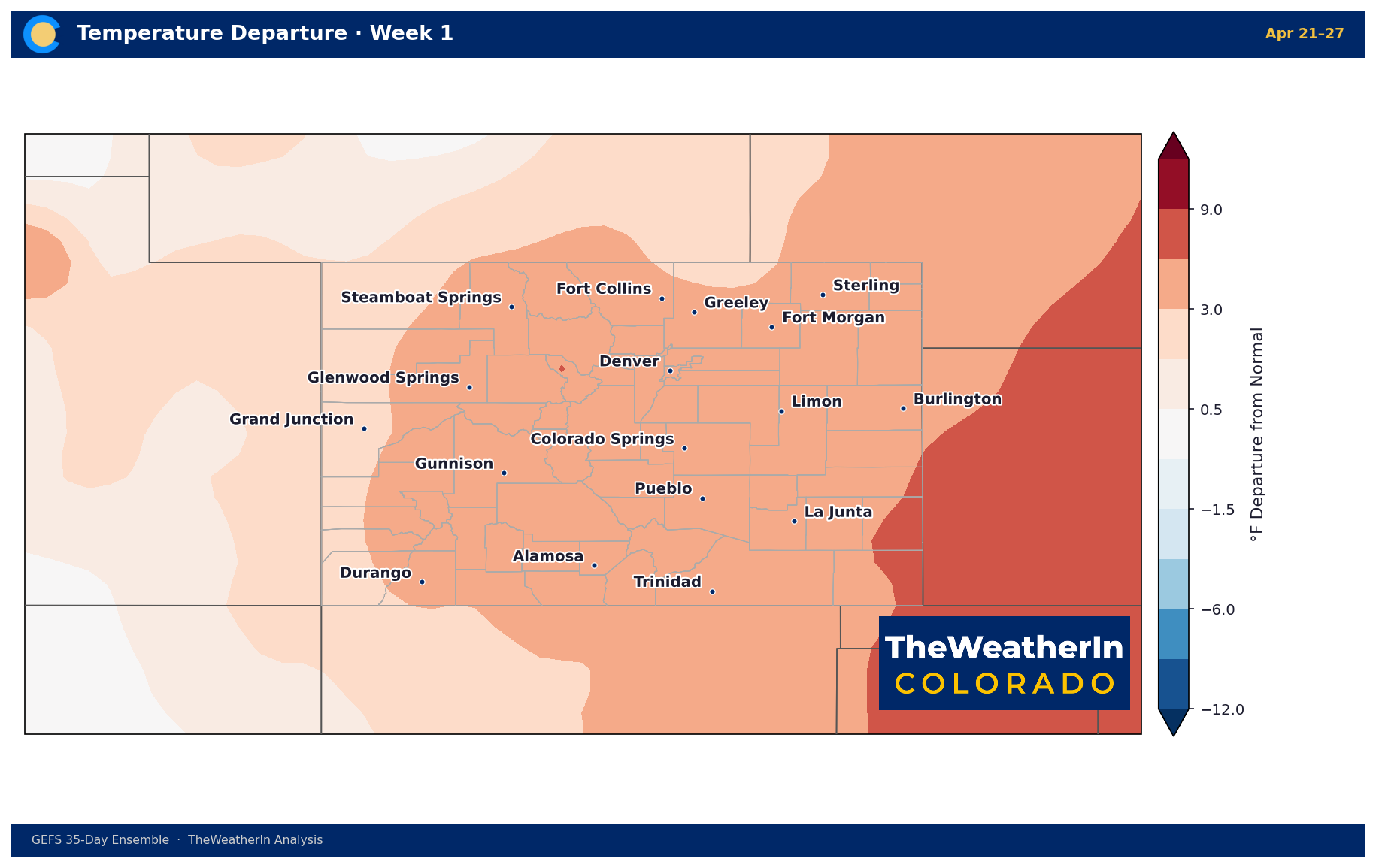
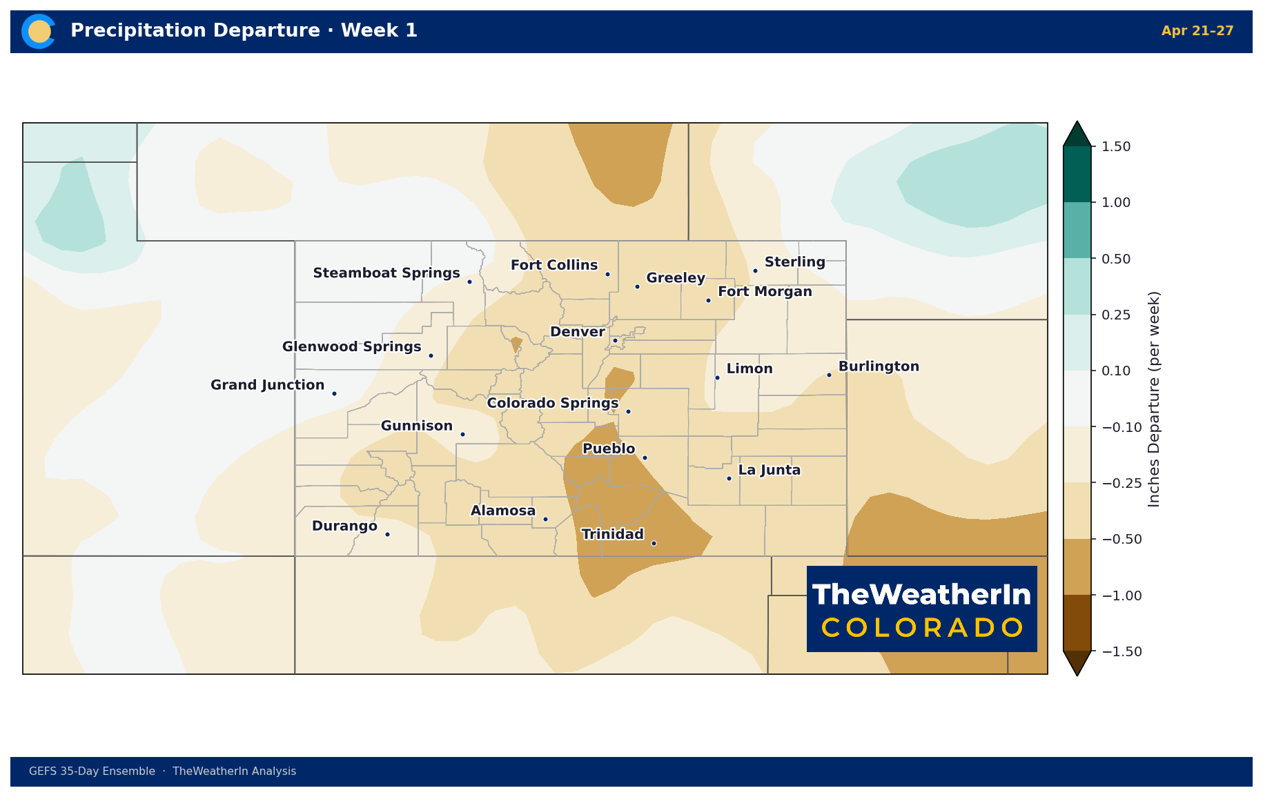
Departure from Normal (Anomaly Maps)
Temperature and precipitation maps show departure from normal — how much above or below average conditions are expected, not the actual forecast value.
- Temperature: Displayed in °F. Red means warmer than normal; blue means cooler. A value of +4°F means temperatures are expected to average 4 degrees above the historical average for that period.
- Precipitation: Displayed in inches per week (weekly maps) or inches per month (seasonal maps). Green/teal means wetter than normal; brown means drier. A value of -0.5 inches means precipitation is expected to run half an inch below normal for that week.
The color scale always centers at zero — white or near-white means near-normal conditions.
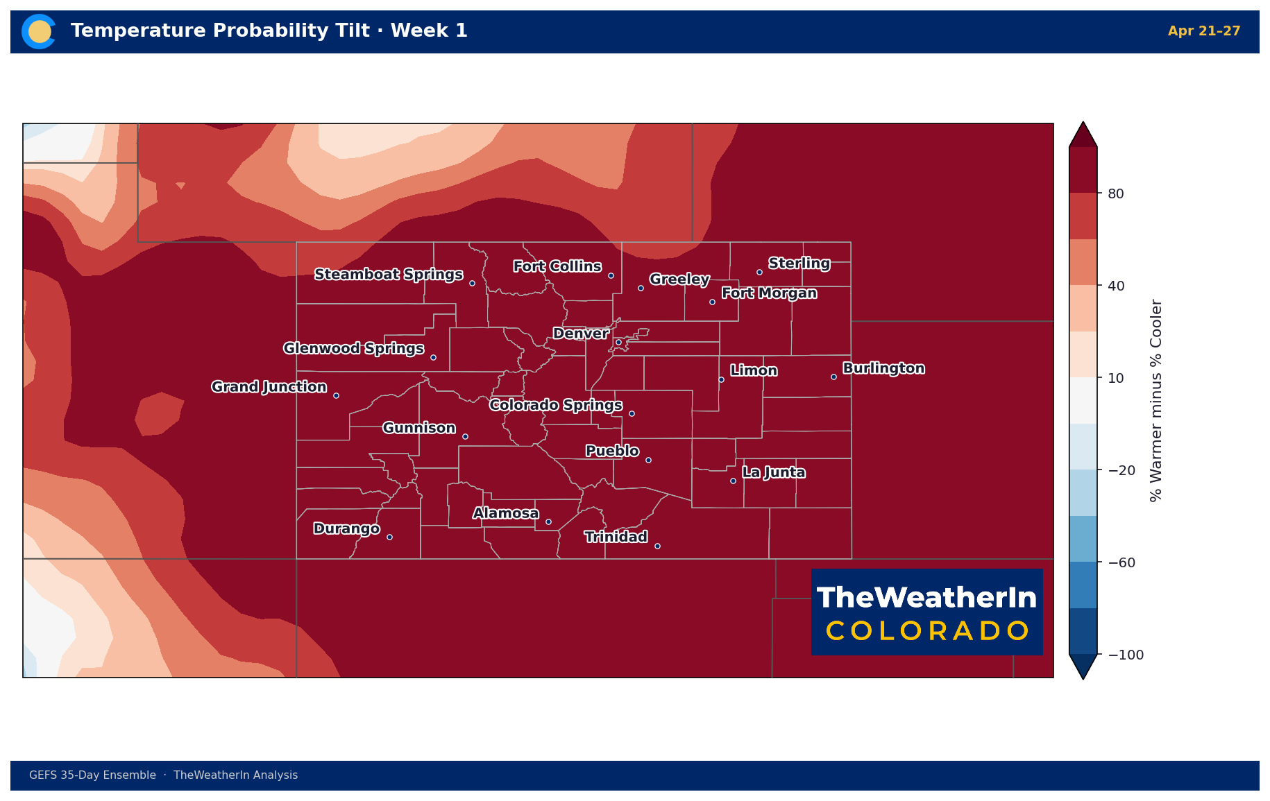
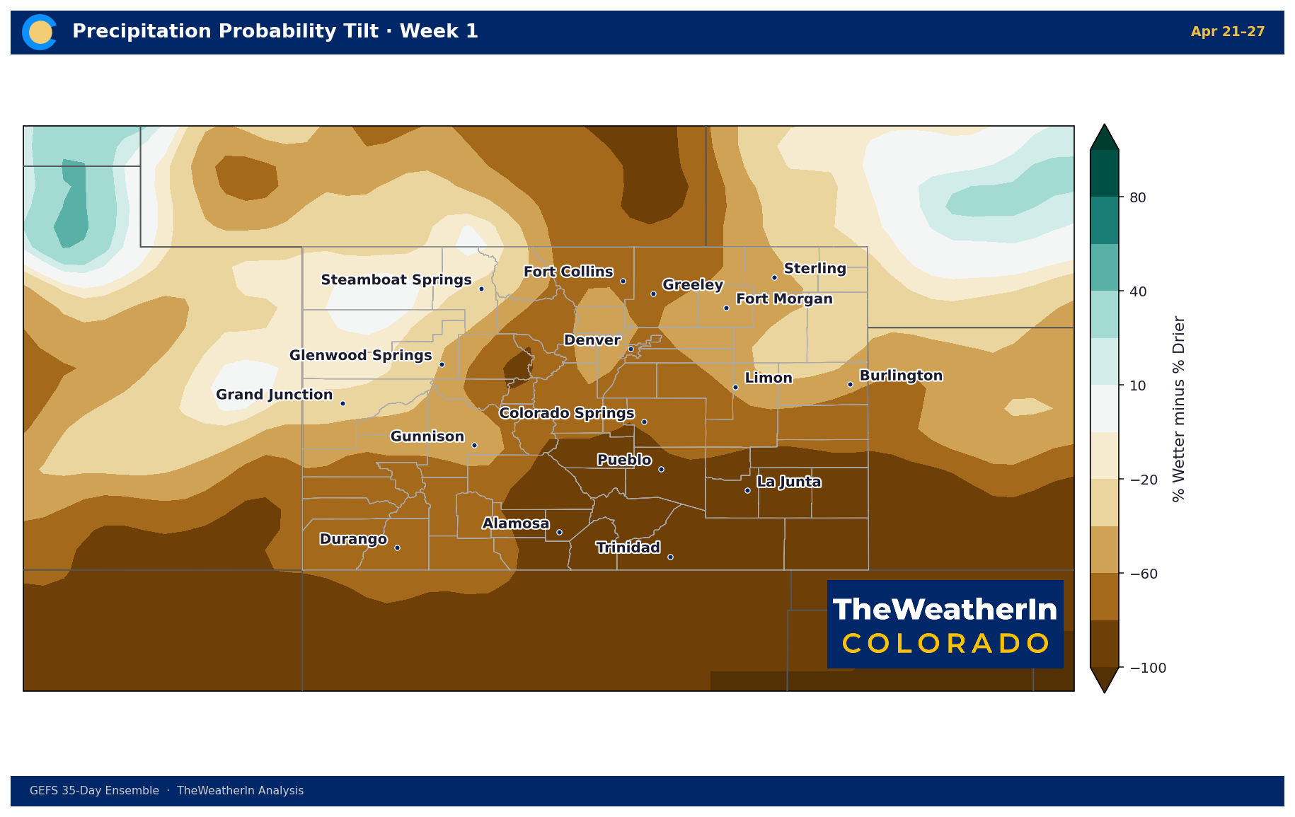
Probability Maps
Probability maps show model agreement direction — what percentage of ensemble members favor above-normal conditions minus those favoring below-normal.
- A value of +40 means 70% of models favor above normal and 30% favor below — a meaningful but not certain wet or warm signal.
- A value of -40 means the reverse — a notable dry or cold lean.
- Values near zero mean the models are split — no confident signal in either direction.
These maps don't say "it will definitely be wet." They say "more models agree on wet than dry." Uncertainty increases with lead time.
Weekly vs. Seasonal Maps
Weekly maps (35-day GEFS ensemble) cover four consecutive 7-day periods. Week 1 is relatively high confidence; Week 4 is a signal, not a specific forecast. Published each week.
Seasonal maps (multi-model ensemble) cover individual months and 3-month periods from 1 to 9 months out. These are best used to identify the direction of the pattern — warm or cool, wet or dry — not specific temperatures or precipitation amounts. Published monthly.
What These Maps Are Not
These are not NWS official forecasts and do not replace site-specific outlooks from the National Weather Service. They are produced from the same underlying model data and historical analogs, interpreted for Colorado-specific audiences.